
Today attention spans are shorter than ever and capturing your audience’s attention is getting increasingly difficult. And guess what? Your audience is primarily on their phones. Recent industry data shows that a staggering 61.95% of all web traffic now comes from mobile devices. Is your website ready to capture its share? If not, you are potentially missing out on a massive chunk of potential customers and revenue. That’s where mobile first indexing comes in.
This shift in how Google ranks websites has major implications for businesses of all sizes and it’s something every decision maker needs to understand.
In this blog post, we will break down what mobile first indexing is in simple terms, why it is paramount for your business’s online success and the straightforward steps you can take so that your website brings in the conversions you need.
What Exactly is Mobile First Indexing?
Mobile first indexing means that Google now focusses on the mobile version of your website to decide how it should rank in its search results.
This is a significant shift from the past, where Google’s focus was primarily on the desktop version of websites. Previously, even if your website had a poor mobile experience, it could still rank well if the desktop version was optimized. However, with mobile first indexing, the mobile version of your site is now the primary factor that Google considers.
Explaining it further
If your website is not optimized for mobile devices, it will likely rank lower in search results. This holds true even if the desktop version of your site performs well. Common issues on non-optimized sites include slow loading times, difficult navigation, and improper display on smaller screens. This can significantly impact your visibility and reach. And you know that low visibility and reach ultimately become opportunities and lost revenue.
The Business Case for Mobile First Indexing (Why it Matters For You)
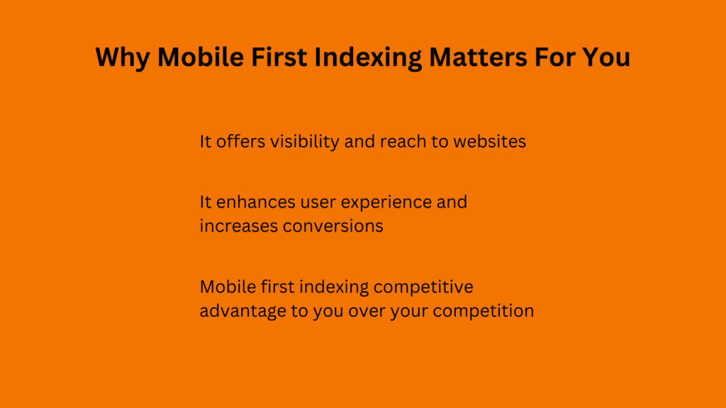
For businesses overlooking mobile first indexing is not just a technical oversight it is a strategic misstep. You will have to bear with tangible consequences for your bottom line. Ask yourself these critical questions:
Can your business afford to miss out on over 60% of potential customers?
With the majority of web traffic now coming from mobile devices, a poor mobile experience can significantly limit your visibility in Google search results. This translates to fewer people discovering your website and considering your products or services.
Are you willing to lose half your potential customers before they even engage with your content?
53% of mobile users will abandon a site if it takes longer than 3 seconds to load. A slow or frustrating mobile experience leads to high bounce rates and missed conversion opportunities.
Are you comfortable letting your competitors seize the mobile advantage?
Your competitors are actively investing in mobile optimization. Ignoring this trend cedes ground to them. You are allowing them to capture market share and leaving you struggling to keep up.
Now let us shift our focus to the practical side of things. Understanding the why is imporatnt, but knowing how to achieve a mobile-friendly website is equally important.
What Does a Mobile Friendly Site Look Like?
A mobile-friendly website is one that is designed to provide a seamless and enjoyable experience for users on smartphones and tablets. But what exactly does that entail? Let us break it down into a few key questions:
Does your website adapt to different screen sizes?
A responsive design is crucial for a good mobile experience. It means your website’s layout and content automatically adjust to fit any screen size, whether it’s a large desktop monitor or a small smartphone.
On a mobile-friendly site, the navigation menu might collapse into a hamburger icon, images might resize to fit the screen, and text will reflow to avoid horizontal scrolling.
How quickly does your website load on mobile devices?
Mobile users are often on the go and have limited patience for slow loading websites. Your site should load quickly to keep visitors hooked and prevent them from bouncing to a competitor. A mobile-friendly site uses optimized images, streamlined code, and efficient caching techniques to ensure fast loading times, even on slower connections.
Is it easy for users to find what they need on their phones?
Navigation on a small screen can be challenging. A mobile friendly site makes it easy for users to find what they are looking for with clear menus and intuitive navigation. A mobile friendly site might feature a sticky navigation bar that remains visible as the user scrolls, or a simplified menu that’s easy to access with one hand.
Are the buttons and links easy to tap with a finger?
Touchscreens require larger targets for accurate interaction. Make sure your buttons and links are big enough and spaced out appropriately to avoid accidental taps and frustration. On a mobile-friendly site, call-to-action buttons are prominent and easy to tap, and links are clearly distinguishable from surrounding text.
Is the text easy to read on a small screen?
Small text can strain the eyes and make reading difficult on mobile devices. A mobile-friendly site uses a font size that is comfortable to read without zooming. A mobile-friendly site typically uses a font size of at least 16 pixels for body text and ensures sufficient contrast between the text and the background.
Is your content concise and focused?
Mobile users typically have shorter attention spans. Keep your content to the point, highlighting the most important information and avoiding unnecessary fluff. A mobile-friendly site uses clear headings, bullet points, and short paragraphs to make content easy to scan and digest on a small screen.
Are your images and videos optimized for mobile devices?
Large media files can significantly slow down your site’s loading times on mobile devices. Optimizing your images and videos is crucial for a fast and smooth mobile experience. A mobile-friendly site uses responsive images that automatically adjust their size based on the screen size, and videos that are encoded for efficient streaming on mobile networks. Additionally, images are ideally under 500KB and utilize modern formats like WebP or AVIF.
Quick Wins for a Better Mobile Experience
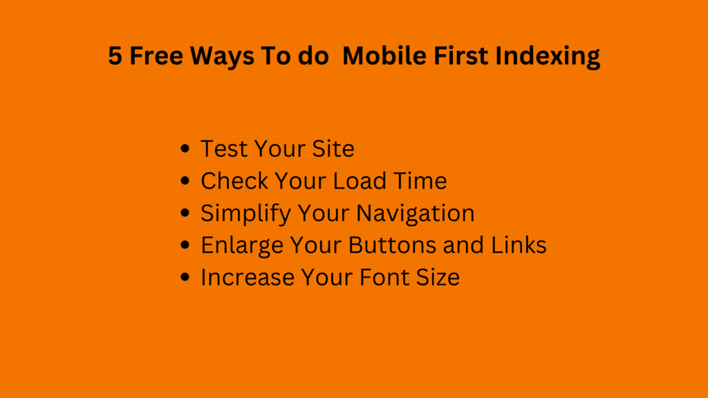
You do not need a complete website overhaul to start making progress toward a better mobile experience. Here are some actionable steps you can take today or within the next 24 hours to improve your website’s mobile-friendliness:
Test Your Site
Run your website through Google’s Mobile-Friendly Test tool. It is free and provides a quick assessment of your site’s mobile readiness.
Check Your Load Time
Use tools like Google PageSpeed Insights or GTmetrix to measure your website’s loading speed on mobile devices. Aim for a loading time of under 3 seconds. If it is slower, identify areas for improvement, such as optimizing images or minimizing code.
Simplify Your Navigation
Review your navigation menu on a mobile device. Is it easy to use and understand? If not, then consider simplifying it or using a collapsible menu to save space.
Enlarge Your Buttons and Links
Make sure your call-to-action buttons and links are large enough to be easily tapped with a finger. A good rule of thumb is to aim for a minimum size of 44×44 pixels.
Increase Your Font Size
Your website text should be easy to read on a small screen. Increase the font size if necessary, and test it on different devices to ensure readability.
By taking these simple steps, you can make a noticeable improvement in your website’s mobile experience and start reaping the benefits of mobile-first indexing. Remember, even small changes can make a big difference when it comes to user experience and search rankings.
Need Expert Guidance?
While these quick wins can set you on the right path, achieving a truly exceptional mobile experience often requires a more in-depth analysis and strategic approach.
If you are looking for expert guidance on how to fully optimize your website for mobile first indexing and maximize your online visibility, our team is here to help. SEO Inventiv offers a complimentary mobile audit to identify areas for improvement and provide actionable recommendations tailored to your specific business needs.
Schedule your free consultation today and let us help you unlock the full potential of your mobile presence.
The mobile revolution is here, and it’s reshaping how businesses connect with their audience online. Mobile-first indexing isn’t just a trend; it’s the new reality. By embracing this shift and prioritizing mobile optimization, you’re not only future-proofing your website but also securing a competitive edge in the digital landscape.
Remember, a seamless mobile experience isn’t just about pleasing Google, it’s about delighting your customers and providing them with the best possible interaction with your brand. The steps you take today to optimize your website for mobile will pay dividends in the form of increased visibility, improved conversions, and sustained business growth.
If you’re ready to reach higher conversion through your mobile presence, our team of SEO experts is here to guide you every step of the way. Let’s work together to ensure your website thrives in the mobile-first world.