Product Page Design – 10 Best Examples to Consider
Product pages are the most important elements of a website when it comes to selling the products online. Product pages incorporate everything, product images, CTA buttons, offer details, product descriptions, etc.
Product design pages demand a concrete design strategy. You simply cannot be random with your product design pages as it might be a major setback for your eCommerce website.
What is a Product Page?
In simple words, a product page is a page that describes a product on sale on a company website. This page incorporates everything, product image, product name, description, price, offer details (if any), and CTA. Some product pages add recommendations too that boosts their sale of other products.
What Makes Product Page Design Important?
According to Oberly stats, 2.64 billion, which implies 33.3% of the world population shop online. Hence, every one out of three people shop online. This is a massive stat, which clearly states that if you have an eCommerce business, you are in for long-term success.
This stat also proves the fact that the eCommerce world is highly competitive. People have various options available, which makes it hard for a single source to stand out.
This is where product page design comes into the picture. As mentioned, your product design page (PDP) will describe your product, and it has to do it aptly. The visuals on your PDP, the way you define your product, the content tone you use, the way you add CTA, etc. largely shape how your marketing strategy performs.
Hence, it becomes massively important to ensure that your product design page design is attractive and a bit unique as compared to your competitors. With your PDP, try to cover the aspects that your competitors haven’t.
Examples of a Product Page Design
Let’s go through some of the best-performing product page designs and understand how they are structured.
1. Amazon – Clean Design & In-Depth Product Details
If you are an online shopper, Amazon won’t be an alien platform to you. This platform is the most visited eCommerce site in huge countries like the USA, India, etc. The range of products it offers along with the product page design it offers is a major reason for the same.
So, where does Amazon win the race? From product images to product descriptions to customer reviews, the platform provides every element in a detailed manner. According to Oberlo, 57% of users read online reviews on Amazon, which makes it a crucial thing on this platform.
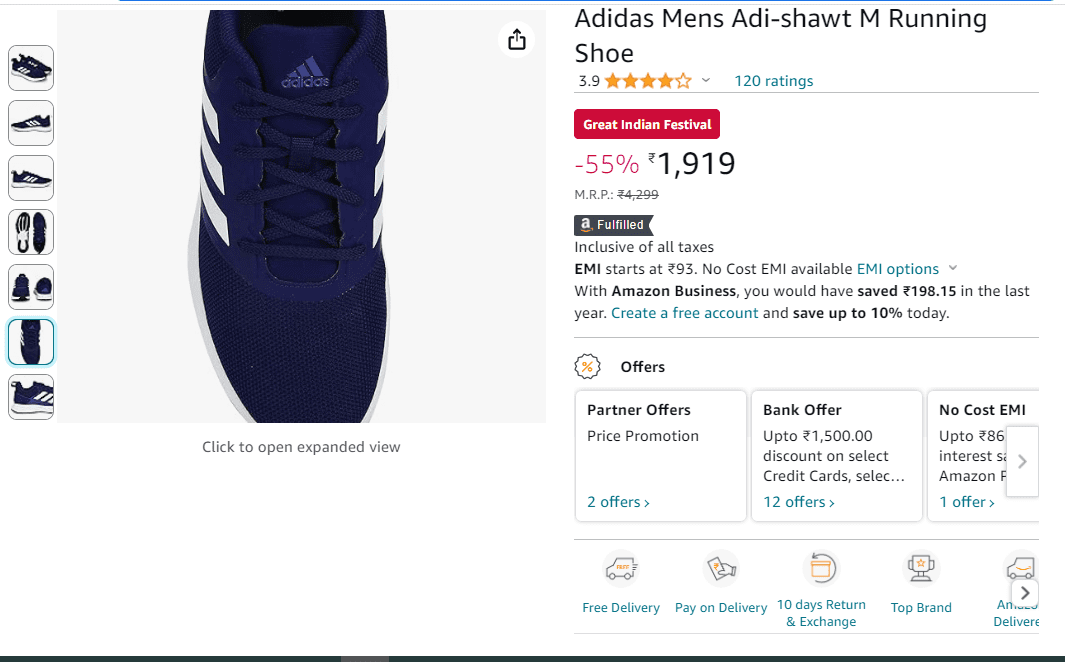
Plus, the unique image aspect of zoom on hover is one thing where Amazon stands out. Some other unique features where Amazon stands out when it comes to product page design are as follows:
- Clear product images where a user can zoom the image to get a clearer idea about the product’s look and feel.
- Product carousel with some useful product thumbnail images and videos that give users clarity about salient aspects and looks of the product.
- Easy to find customer reviews and ratings. The user just needs to click on the number of reviews and ratings to check them out.
- Easily visible offers where users can see them even without scrolling down the page.
- Detailed product specifications, where a buyer can get an idea about both, the features & technical specifications of the product.
- A comparison table of similar products where users can check and compare similar products. They get a platform where they can decide among several products even without changing the page.
- Too much information still the design is such that the buyer doesn’t get overwhelmed while exploring the product.
Amazon has followed the product page design that works as an all-in-one platform to not only check the product, but also to compare products, check customer reviews, check products from different angles, and much more.
2. Square – Spacious & Informative!
Square is a mobile transaction company that provides businesses with a platform where they can collect payments from customers. Ever seen those payment scanners? Yes, Square is one of those numerous providers of these systems.
Well, Square is by no means like Amazon where it provides everything on a page. But it ensures that buyers get every information they require and that too without getting overwhelmed even a bit.
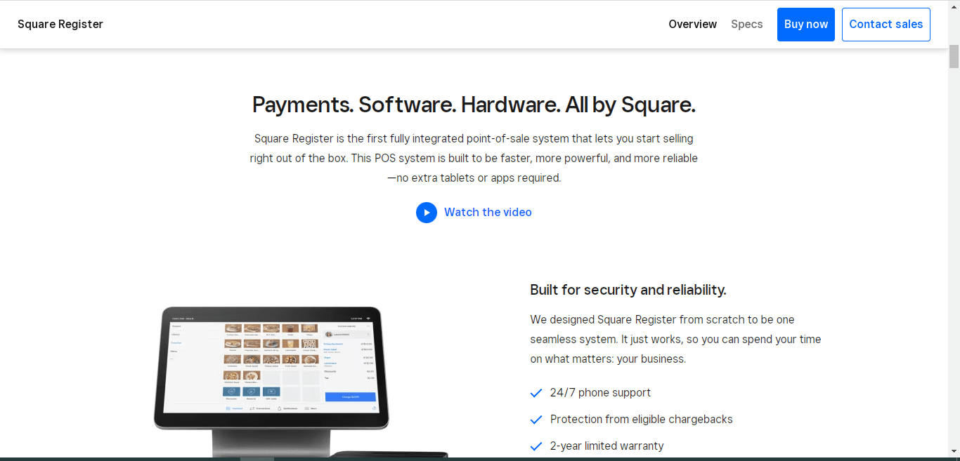
Some major aspects that make Square product page design a good example are:
- Clear images representing the application of the product.
- The product is assigned to a category and each category is displayed in the header of the PDP.
- When you scroll down, you find product tiles where information about the product is displayed. You can simply click the CTA button to land on the PDP of that specific product.
- Easy to find customer support. Just scroll down, and you will see the options to contact the customer support team.
You won’t find Square using too many graphics or a lot of content. But, everything on this platform is on-point and clean. Plus, they have ensured that user doesn’t lack any piece of information before ordering any product, which is definitely a great thing.
3. Compliant Learning Resources – Selling Training Materials Creatively & Neatly
Compliant Learning Resources is a platform that provides RTO resources like the learner’s guide, assessor guides, and much more.
The easy navigation and the ease of form filing on the platform is one aspect where this platform stands out. Their simple form is one major reason why this platform generates a lot of inquiries.
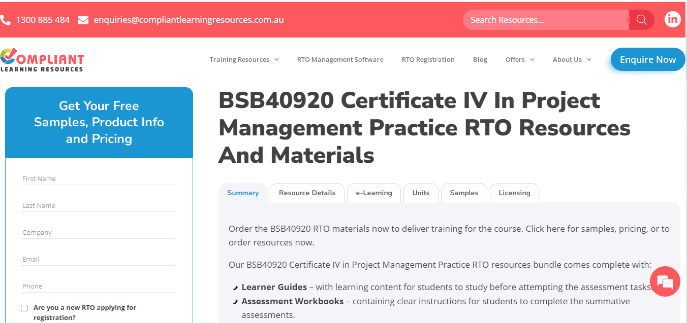
Major highlights of product page design on Compliant Learning Resources are:
- A simple form where you can even post your inquiry. Hence, no need to register anywhere. Just fill out a form, submit your inquiry and the support team will answer you in a few hours.
- One unique thing about the platform is that it provides contact details right on the header. No links, no navigation to another page, nothing. Just a simple phone number and email address.
- A sticky header and all the categories listed over there make the navigation super-easy for the users.
- Just scrolling down once makes the user see the best offers and promotions. It is a good marketing strategy as it actually makes users stay on the platform.
Compliant Learning Resources doesn’t use any graphics on the platform. There are very few platforms that win the game without any graphics and this platform is one of them. The rich content it offers and the easy navigation along with a simple form are major reasons for the same.
4. Apple – A Simple Checkout Journey!
Well, as giant Apple is, its official website is extremely simple and actually fun to explore. With the product image in the center and variations and model options on the right side, the site follows minimal yet effective aesthetics.
Several eCommerce sites have different pages for product variations and models. However, Apple provides everything on a single page, which definitely improves the user experience considerably.
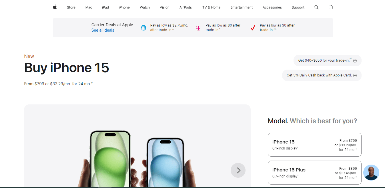
Other highlights of Apple product page design are as follows:
- A single page to display product variation and the model. Hence, the need to navigate on different pages to check out similar products is eliminated.
- The chat icon in the bottom-most right screen makes it easy for the users to contact customer support. Apple might be a huge platform, but finding customer support is not really difficult.
- When you scroll down a bit, you find a section that reads “Which iPhone is right for you?”. It compares several iPhone models that actually help users make the right decision.
Apple follows a product page design that doesn’t distract users even a bit. From checking the product image to checking similar models, you can do everything on a single page. The minimal aesthetics along with simple navigation make the customer journey smoother on this site.
If you are looking to follow a simple product page design, Apple can be your ideal reference.
5. Leesa – Highlights Important Things to Help Buyers Select the Right Thing
Leesa is a website that answers all your questions when you explore any mattress or bed. Be it reviews, benefits, or savings offered, everything is highlighted promptly which further makes your purchase decision easy.
Just scrolling down a bit displays you accordions where aspects like product specifications are displayed, and important questions are answered.
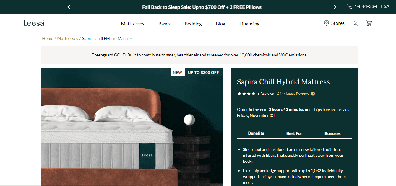
Reasons why we love the product page design of Leesa are:
- As mentioned, Leesa subtly highlights benefits, bonuses, and application of the product. It makes it easy for the buyers to decide on their purchase.
- Important product information is displayed efficiently in the form of accordions. You get every piece of information in these accordions.
- The product page incorporates customer reviews posted. This site doesn’t post any sort of screenshots. Here, you actually see what customers post, which is another salient aspect of this site design.
- Some marketing strategies that play with buyers’ psychology are discount displays on product images, sticky Add to Cart button, etc. They might seem to be minor things, but actually boost conversions considerably.
Leesa is all about reviews, offers, and information in the accordion form. Again, there is no use of heavy graphics, but the way they highlight every crucial piece of information makes it our favorite.
6. Volkswagen – Takes You Through Car Build Process
Volkswagen follows one of the best marketing strategies. Rather than focusing on selling, the PDP takes you through the entire car-buying process without making you feel bored or overwhelmed.
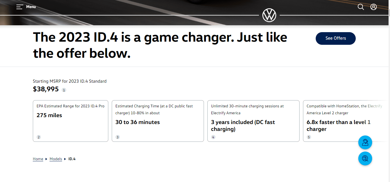
Along with the process, you also see the features along with the customization options available.
Major highlights of Volkswagen product page design are:
- Car building process that gives you an idea of what you will get as a car owner.
- When you scroll down a bit, you see accordions that give you information about the car’s interior, exterior, features, driver assistance, etc.
- The live chat option along with shop inventory options are visible throughout when you scroll up or down, making your stay smoother on the page.
- A sticky header is another aspect that Volkswagen has provided to maintain a smooth user experience. From registration to search, everything is easily navigable on a PDP.
Volkswagen largely relies on the content it delivers. It actually defines the definition of a true PDP that gives you a piece of detailed information about the car. From car specifications to car reviews, you simply can go through everything by scrolling up or down.
7. Boohoo – Busy Yet Clean Interface
Boohoo is one of the leading brands serving quality clothes along with other accessories. The product page design of Boohoo is a bit busy, yet extremely clean and attractive which makes users stay on the website, explore products happily, and actually make the purchase.
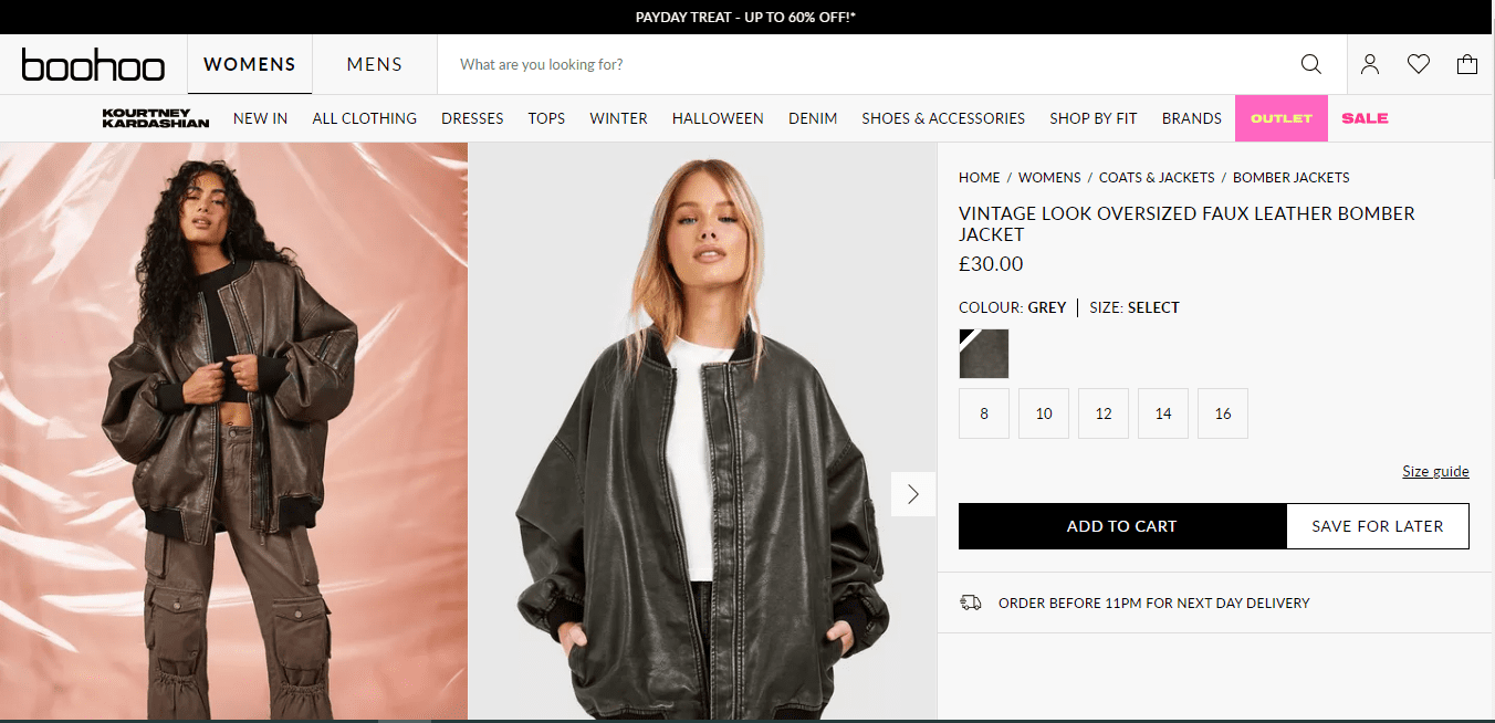
Some salient aspects of Boohoo product page design are as follows:
- Much like Amazon, Boohoo comes with a zoom-on hover effect which allows the user to check a product from a close point.
- Promotions, if any, are displayed immediately beside the product price, which imparts that positive psychological impact on the customer’s mind. It is actually a great marketing strategy that you can keep in your mind.
- When you scroll down once, you see accordions that give you product description, delivery & return information, which is important for a customer. They have presented these pieces quite effectively & in an organized way.
- The “We Think You’ll Like” & “Complete The Look” sections display the product recommendations.
- Just above these recommendations, you can see the payment modes and the offers you get with each of these modes. It is actually helpful for a customer when it comes to the checkout journey.
- The footer section provides other crucial links like order tracking, country selector, scanner, Play Store link to download the Boohoo app, etc. Again, the content might vary, but you can get an idea of what elements to include in the footer.
8. Luxy Hair – PDP Design Catering to the Target Audience
As the name implies, Luxy Hair has women as your target audience. This is the major reason why you get that feminine touch when you land on this site. Hence, if you have a target audience that caters to a specific gender or age, you can keep this factor in mind.
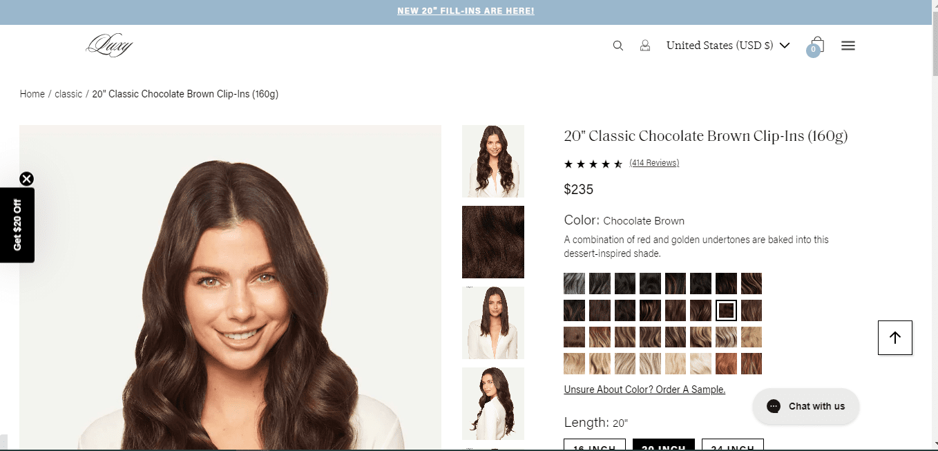
Let’s check out major aspects where Luxy Hair caught our attention:
- As mentioned, the site not only on PDP but throughout, maintains a feminine touch. It is one of the best things that has actually worked for the brand.
- Each product of the brand comes with a large number of variants. However, the brand has displayed them such that the buyer doesn’t get overwhelmed or confused by any means.
- They clearly display the Chat button which assures the buyer that the customer support team is always around them to help them out.
- You don’t get bombarded with too much information or newsletter subscription CTAs. Yes, they do display promotional stuff, but quite subtly.
- Scroll down, and you will see a large number of customer reviews on every PDP. No screenshots, nothing! In fact, actual reviews of what people feel about the product.
9. United By Blue – Minimal Yet Catchy
United By Blue sells various accessories like bags, shoes, socks, etc. When it comes to product page design, it is one of the best examples when it comes to keeping it minimal yet effective.
When you land on the PDP of this brand, you will notice that like other PDPs, there’s no too much content or any accordions. However, such is the creativity used that you get detailed information about the product you are checking.

Some major things you can learn from this PDP design are:
- The brand is an ideal example of a simple PDP. No fancy colors, no too many graphics, or no overwhelming promotion displays. Yet, the brand has succeeded in delivering what the user actually wants.
- The brand provides a sizing chart too on relevant PDPs. This actually helps the customers to make better decisions when making a purchase.
- They have a mission where on every purchase, the brand removes one pound of trash from oceans and waterways. If you have any such mission, you can clearly display the same on your PDP too.
10. Astley Clarke – Explain Product with Storytelling
Astley Clarke explains each product with storytelling. Well, this is quite a unique and extremely catchy way to gain the attention of the buyers and actually make them complete the purchase.
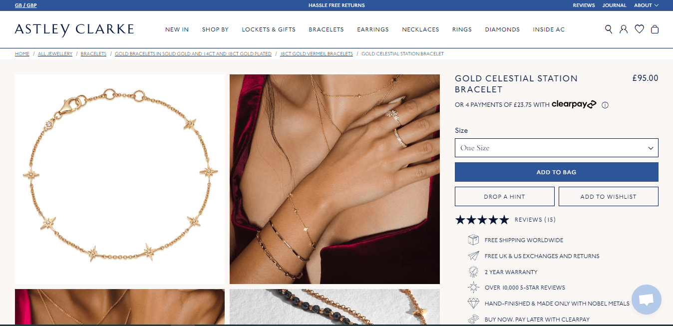
Some catchy points that make Astley Clarke product page design special are as follows:
- You get to know every product with a unique storyline. This is one of the most amazing ways to make a product remembered by a buyer even when a purchase isn’t made.
- Astley Clarke clearly highlights the amazing benefits it offers. For instance, free delivery worldwide, and warranty for a longer timeframe. Of course, nothing wrong in highlighting what you are offering that other brands aren’t.
- The “Goes Well With” section subtly markets other products by showing a relevant product to the PDP one. This is a decent marketing strategy without sounding spammy or annoying.
- The PDP doesn’t have any hover effect. However, the brand presents you with several images of a product, which makes it easy for you to understand the product.
Product Page Design – Best Practices to Keep in Mind
Some of the best practices to keep in mind to ensure that your PDP does well for you as a brand are as follows.
Make it Easy for the Visitors to Find Things They Want
Numerous brands make the mistake of cluttering the PDP with unnecessary items that actually make it difficult for visitors to find things that they actually want. If that’s the case with your PDP, it would take a few seconds for your customers to turn to your competitors.
Hence, make sure to keep your PDP clean and make it easy for the website visitors to find the elements they want on your website.
Add Some Personalization
How about allowing the buyers to customize the products the way they want? Well, it’s not possible for every business domain, but if it is, you can definitely try it. It actually works as an enticing point for the buyers, and you add that important point of personalization to your PDP.
Keep the Product Description Informative & Detailed
Product description will be one of the first things the potential buyers will read to get more information about the product. Hence, it has to be detailed and actually informative. Try to provide maximum information about the product in fewer words here.
Back up the description with facts, and customer reviews. It would add that element of proof and play a crucial role in establishing that trust factor among the potential buyers.
Provide Elements Like Customer Reviews & Live Chat
These elements are completely different from each other, but both follow the same purpose of making sure that the customer actually trusts what you offer. Customer reviews help customers select the right product with peace of mind and live chat makes the customers believe that if any help is required, customer support is always around the clock.
Providing such elements that would help the users to smoothen their purchase journey would play a crucial role in completing the purchase.
Help Users to Compare Products
As a customer, comparing two products is often difficult, specifically, when the compare feature isn’t offered on the same page. You can include this feature on your PDP to help out the users. You can add a table where you can compare the specifications of similar products.
Helping the users to compare products will not only help your customers decide the best but also make them believe that you are ready to go a mile ahead to help them out.
A/B Testing Tips to Improve Your PDP Design
Extensive A/B testing is always important to make sure that your PDP design is top-notch and also to enhance your website CRO. Some important tips to keep in your mind when it comes to A/B testing are:
- Keep on making adjustments with CTA on PDP. Change CTA text and button color as per the product, offers, festive seasons, etc.
- Keep on analyzing important metrics and tweak your strategy according to these metrics. You can check important GA4 reports for conversion rate optimization and tweak your strategy accordingly.
- Keep on playing with the navigation, sidebars, promotion displays, etc. Analyze which strategies and viewpoints work the best for you and which don’t.
- Keep on studying your competition and get ideas from the new strategies they are following. Of course, don’t copy them, but form your new ideas out of them.
Optimize your website for success with our expert Fully Managed SEO Services. Begin your journey with a free SEO consultation tailored to your goals. Check out Fully Managed SEO Services and claim your free strategy session at Free SEO Consultation.
Final Words
If you are looking for an attractive PDP design, the above-listed product page design examples can be your ideal source of reference. Be it keeping it busy and attractive, or clean and soothing, the above list covers every PDP design idea.
When it comes to PDP design, it’s all about how well you deliver what buyers want, how well you highlight salient aspects your products offer, and how easy is navigation on your site.
Rest, if you are looking for professional help to help you with your product page design, or if you are looking to make it compatible with the latest SEO guidelines, you need not look any further than us. Our experienced team can ensure that your product page looks amazing, and caters to the buyer’s requirements efficiently. To connect with our experts, contact us at +91 836-844-7355.
Check our Blog on Guide to GA4 Migration and Setup with Google Tag Manager


 WhatsApp Now
 +(91) 8700778618